Innovation In Form And Function
The Brief
The owners are long term friends and have been great clients over the years in various ventures. The site had an old house in poor condition, complete with asbestos cement sidings and roof. Since 2002 we looked at various ideas, and in September 2008, the following email arrived.
“... could you proceed to draw up some sketch plans for a house at Oceanbeach Road. We have no particular design in mind so we need to rely on your creative skills. “
What further invitation does an Architect need !
“However, [there is always an “however”] we would like any design to include generally the following:
- the design and construction must not exceed $400,000;
- have an open kitchen/dining/ lounge area, preferably having these facilities on the ground floor;
- have an emphasis on indoor/outdoor living;
- have three bedrooms plus study (which could convert to a bedroom);
- main bedroom to have ensuite;
- upstairs and downstairs bathrooms;
- no necessity to go to three storeys unless you advise otherwise;
- have two car garaging;
- have outdoor shower and barbecue area;
- be an attractive design for resale purposes.“
Tall order ?.... Well 3 stories was.
There was little to be gained in terms of aspect – so with the budget in mind – and my comment to the client about being an optimist and not a magician all too fresh in the memory - the sketching of a 2 storey version began.
Plan organization
There are many subdivided lots in the Mount Maunganui – Tauranga area, with 325m2 being the minimum. My general observation is that these are not handled well, and the minimal exterior space tends to be what is left over rather than integral in the design.
The art of designing on a small site is to make both house and garden feel apparently more spacious than they are physically.
Consequently, my practice now has a focus on particularly designing for these compact sites.
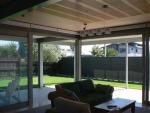
In this case, we settled on a container holding the upper floor bedrooms with second lounge, surmounting a living pavilion and loggia. The ground floor opens generously to the loggia and garden on the north east and north west.
The Local Authority require a minimum 50m2 living yard containing a uniform space of at least 4m by 3m. However, in a 393m2 site, we were able to achieve a living yard of 116m2 plus the loggia of 56m2. The rest of the footprint being 69m2 ground floor plus 37m2 for a simple garage.
The garage is placed in the south west, almost unseen from the street.
Form
A principal aim was to have clarity of form and minimize the external complexity.
Hence the rectilinear container. Cover is achieved by “subtraction”.
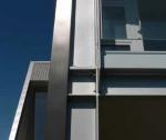
The north east street frontage, which is largely glazed, is recessed, and the loggia “stripped” from the lower mass on the sunny aspects. The steel skeleton is left exposed by this peeling back of the skin.
The rotated pod, with joinery and cladding angled with the form, hasfortunately been associated with insobriety – not disaster. [This was designed before the Christchurch quakes.]
Apart from reflecting the ascent of the stair, and catching of morning sun to the living pavilion, it adds a measure of architectural humour. The passing observer, invariably does a “double take.”
Material
While not beach front, the site is clearly affected by the marine environment.
A tough skin is required. So the theme of “Reptilian” skin, “Mammalian” interior was pursued. The skin :
Which product has ;
traditional links,
- is light and easily fixed in large pieces,
- associated with strength,
- has no public phobias regarding weather tightness,
- wide colour range,
- should not need to be recoated for more than 15 years,
- is easily removed and recyclable
- and will fit the budget ?
Hence our choice of the corrugated profiled metal with the higher specification coating.
The chosen colours of Ironsand and Gunmetal reflect the metallic nature of the material. Importantly, all the presented metal surfaces are rain washed. The recess soffits and linings, which are extensions of the interior surfaces, are non metallic. The only non standard detailing, comes with the skewed windows.
These have welded stainless steel flashings on four sides, with back flashings extending to the bottom of the cladding from the down slope jambs.
The interior:
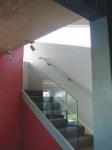
Colour – particularly the Resene “Hot August” - and plywood are used to achieve the contrasting warmth of the interior.
Inside the rotated pod, the rotation is reflected with the tiling and lining following that geometry. Plywood and painted MDF linings were used with expressed joints, preferred for its robustness and avoidance of stopping. The success of the interior design is testimony to the skills of Marilyn Cleland.


