Pushing the boundaries
Faced with a steep, tight site in central Auckland, designer Hamish Stirrat knew he would have to literally push the boundaries to achieve his design brief for a four-bedroom family home.
As Hamish, of Fabricate Architecture, says, “It was clear from the outset that the project was going to be anything but straightforward. The client’s parents had subdivided a section, which resulted in a 300sq m site with a very steep gradient. The couple was planning to start a family and wanted to be close to the family network, so the proximity of the site to the family home and the city was very attractive. If the couple were able to build a house on the difficult site and to budget then they could have the land. If not, they would sell the land to help finance a home further from the city and family support.”
He says the brief for a four-bedroom, two-bathroom home with a large open living space and two off-street carparks on the north-facing site in itself was not difficult. It was the small, steep section with heavily imposed council restrictions and a tight budget that provided the challenges.
“It was evident from the onset of the design process that a number of planning infringements were required to make any house work on the site,” Hamish says. “So from the beginning of the design process the neighbours were consulted to create an open dialogue between the clients and their immediate community.”
He says the cooperation of neighbours in signing off any infringements was vital and that meant he had to come up with a design that was sympathetic to the neighbourhood and not too imposing.
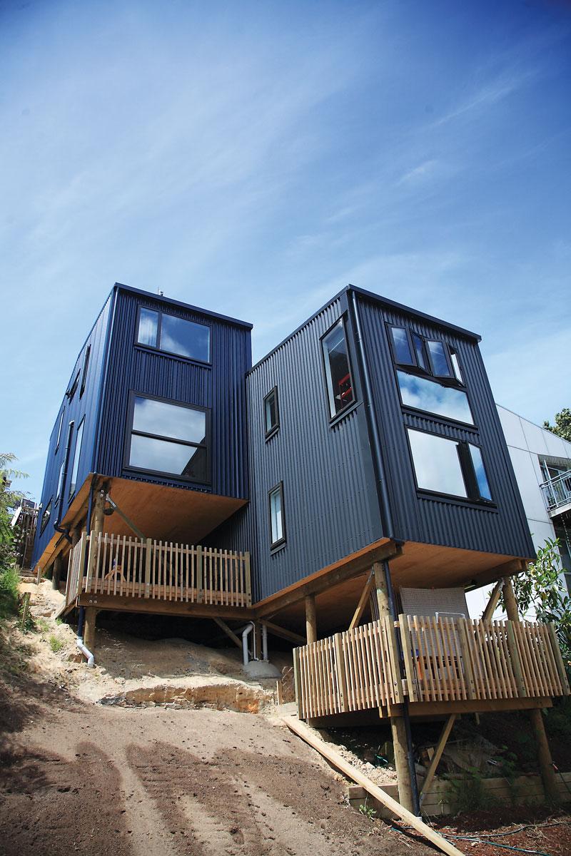
“In profile, the dwelling is conceived as a simple archetype pitched roof form that reflects the traditional villas, bungalows and state houses that surround the site,” Hamish says. “To ensure the large mass did not dominate the site, it is split into two and relevelled to absorb the gradient of the site. This helps to articulate the house as well as reducing potential overshadowing and view restrictions from the neighbours’ properties.
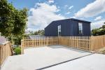
The home is arranged on the slope so that the upper two-storey wing is a level higher than the offset lower two-storey wing, creating a three level home with the wings joining at the middle level to create a large open plan living area, with two bedrooms and a bathroom on the top level and the same again on the bottom level. The roofline is gently gabled.
Hamish says apart from getting neighbours’ buy-in, using longrun metal cladding and roofing was an important factor in meeting the budget constraints and achieving the design aesthetic.
He says, “Although there was inevitably going to be large earthworks costs for such a steep property, as a strategy to conserve the budget, complex engineering for the balance of the house was reduced to the bear minimum. The lightweight standard timber structure perches comfortably on low cost timber pole foundations that anchor into the rock 6m below ground.
“Using light steel cladding was an integral part in 10-20% reduction in framing costs.”
He says longrun was an ideal solution for a number of reasons:
“It allowed us to use the same sub-contractor and supplier for both the roofing and the cladding, which gave us both time and cost efficiencies.
“It is a proven and robust cladding product that has a straightforward maintenance schedule that is easy for the client to undertake without too much fuss. Particularly as there are very some very hard to reach areas of the house, to say the least.
“It has a handsome appearance that has a degree of elegant modernity to it.”
Hamish says being Fabricate’s third house with longrun material, they felt confident they could squeeze a bit more design detail out of it, beginning with arranging the cladding vertically.
“With this project we wanted to develop the standard supplier’s details and spend a little more time working with the installer to create bespoke junction detailing. As the overall form of the house is relatively simple we needed to fine-tune the typical details to ensure that the overall appearance of the house retained a degree of effortlessness. Once we understood the principles of how to use profiled metal, we have found that there is a certain freedom to achieving different and unique details that is often not possible with other cladding products.
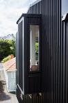
He adds, “As the overall form was boxy we really wanted the windows and doors to look like they were penetrations in a mass, rather than framed window openings. Traditional open head, sill and jamb details in vertical long run cladding require large overlaps to absorb the difference distances to the corrugates. Often this is too difficult to coordinate in the drawings as onsite tolerances can change from project to project. So we needed a flexible jamb detail so we could place a window or door anywhere along a wall regardless of where crest or trough is. To achieve this we reversed the detail so the flashing runs in behind the cladding. This detail essentially acknowledges that water is going to enter negative detail and an internal soaker flashing deflects this and expels it at the bottom of the wall.
“Another example would be the external corner junctions when a window is located in close proximity. This becomes a complicated staging process as you start building up the composition of the corner. Previously this had been quite a laborious process that resulted in an unsightly number of fixings. With self-supporting flashings being made of the same material and colour as the cladding we managed to fine-tune a fixing-less negative external corner that slides into position and is locked in place by top and bottom flashings.
“We find that the detailing is a constantly evolving process as we create highly tuned details out of necessity.”
Creating outdoor living spaces provided another challenge on the tight budget and small site.
“When you have only 300sq m with a house and two-car carport there’s not much left for outdoor entertaining,” says Hamish. “And with the budget we certainly couldn’t afford to have a deck protruding from the house.”
“Anything outside the building line of the house became a luxury that could not be entertained within the budget,” he says. “So opportunities for outdoor spaces were found as a result of the building process. Outdoor patios were formed from cuts of the retaining walls required to stabilise the house into the site. The sub floor decks would have otherwise been a disused and unattractive space. But due to the steepness of the site are now sheltered nooks that get the sun throughout the day.”
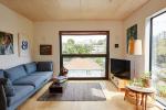
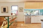
Inside, the home has plywood floors with a clear matt finish, white painted gibbed walls and whitewashed plywood ceilings.
The main living area has a higher ceiling than the two bedroom levels.
Hamish says he is pleased with the design of the home, which sits well in the neighbourhood.
“It looks like quite a small house from the street; it’s very inconspicuous.”

