Hynds Build An Icon For The Future
Neil Wyatt of Dalman Architecture Limited
Often with Industrial projects of this type our Clients will come to us with a very rigid and functional brief with little room for aesthetics. This was not the case with the Hynds Pipe System project where their aim was to grow their concrete and plastic pipe business into the South Island, calling for the building to become an “Iconic” flagship for their future expansion plans.
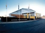
The building was required to have 450 m2 of warehousing with an adjoining 120 m2 of offices. This would form the basis of our brief and the Clients words “use your imagination - but keep it cost effective” forming the remainder. The site is on the southern periphery of Christchurch with a strong relationship to State Highway One. The new building is the first major industrial building to be seen on approaching Christchurch.
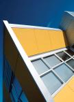
Our response to the brief was a concept of “fractured forms” with the warehouse and office elements defined in a mix of Zincalume©, compressed sheet and painted tilt-up concrete panels. The offices had to be located on the north - east corner of the warehouse to suit the internal and external flow of the building. This resulted in a potentially visually difficult integration between office and warehouse - a critical aspect to get right on any industrial project. Our solution was not to hide this potential conflict, but highlight the interplay of forms with the office wall set at an angle to the warehouse, and with the office roof also angling up towards the highway. The offices do not appear to be “tacked on the side” like many similar industrial developments, but appear to emerge out of the end of the warehouse and fly out from it.
The main vehicle entry is not from the State Highway one, therefore the building required a second frontage to address visitors to the site. Wedged elements in hardwood slats and charcoal plastered concrete, lift up out of the ground plane to mark the building from this aspect. A staff courtyard is formed within the sheltered prow of hardwood slats. Signage and flagpoles provide corporate opportunities for the business from this entry aspect.
The interior of the warehouse is simply handled with concrete walls and floor with a steel portal framed structure and steel cladding all exposed.
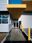
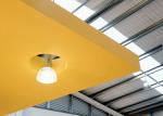
The reception area highlights concrete systems with its terrazzo floor and concrete reception counter with horizontal banding inlaid with stainless steel. The main entry canopy floats into the building and “folds down” into the floor to frame the reception counter.
The exterior colours are bold; in keeping with the industrial use. This helps a relatively small building stand out in the larger asphalted environment around it. Yellow and grey are the corporate colours of Hynds and these colours work well against the metallic look of the Zinclalume© coated Dimond V-rib© wall claddings and Dimond Styleline© roofing.
Industrial buildings as in any other work place are the part of our built environment which many people spend most of their working life. They should not be reduced to arbitrary metal or pre-cast concrete boxes bereft of style or imagination through the lack of a little thought at their conception. Designing in a creative way with differing configurations of materials does not necessarily mean more expensive results. If we can achieve an engagement of the people's minds in how these buildings look and function then all of our working environments can only improve.

