Energy efficiency, sustainability and durability

When architect Mitchell Coll designed two adjoining townhouses in central Christchurch, he also future-proofed them by making them removable and joinable. “Eventually the land will be worth more than the buildings so I would like to think that they will be moved off and used as baches rather than being demolished,” says Mitchell. “You see that a lot here in Christchurch with land values going up and houses being demolished.”
The townhouses are also designed so that with a few simple modifications they can be made into one four-bedroom, two-living room house. With high quality construction and durable materials, it is hoped that they can have a long life by being adaptable to the ever-changing needs of the owners.
Mitchell designed the 74sq m homes on the 300sq m site for young professionals with energy efficiency, sustainability and durability at the forefront of all decisions, without compromising aesthetics. Floor plan and volume efficiencies were made where possible to keep the energy and costs to a minimum, for both the building and running of the homes.
The houses sit on steel bearers on screw piles with brackets. The adjustable brackets allow one person to easily relevel the building up to 120mm in under two hours. “The ground conditions are something like 6m of peat then 150mm of gravel then 6m of peat so essentially there is nothing to bear on,” he says. “That peat is going to decompose so the houses are still likely to move even if you put down a concrete footing. By having the steel it’s easy to get the building off the ground and have it cantilevered. With just eight steel bearers it’s really simple to adjust the foundations and they make for easy sub floor access for services and if you want to move the building.”
While the screw piles and steel are relatively expensive they are quick and easy to install, saving time and labour. To further aid speed of construction, cross laminated timber (CLT) was used - and it also has good acoustics, some thermal mass, as well as allowing for unique detailing such as recessed LED strip lights, a cantilevered canopy with no structure beneath and true floor-to-ceiling windows. The CLT stair detailing allows for a prefabricated architectural open tread stair that can be installed quickly and at minimal cost.
Mitchell says all materials were selected based on sustainable qualities such as New Zealand grown pine for the CLT and ply lining - both acting as a carbon sink along with natural oils and wool insulation. The CLT floors in this building hold 20 tonnes of carbon alone.
Designed for passive solar gain, the homes’ airtight construction with R3.6 insulation value of floors and walls and R4.2 for the ceilings gives excellent heat retention. The heat recovery ventilation system provides fresh air for a healthy home with minimal heat loss in the winters. Passive ventilation is achieved through strategic placement of windows and skylights for zero energy summer ventilation.
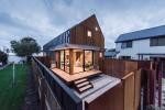
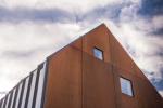
New Zealand’s alpine huts were the inspiration for the form of the building, which also nods to the Brutalist and ‘Christchurch School’ buildings of the 60s and 70s. The use of Canterbury Prickles and E-Span® 470 tray roofing, rusted natural steel, the gable-to-gable form and honest materials all contribute to this aesthetic.
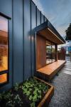
Mitchell says the Corten steel rainscreen is detailed to achieve a minimalistic look so the small building does not look overly complex or heavy, helping to keep the exterior areas feeling spacious. The colour of the Espan® 470 tray roofing - ‘New Denim Blue’ - was chosen because it will go well with all the shades of orange to brown of the Corten steel as it ages, as well as helping such a contemporary building fit in to the surrounding 1990s neighbourhood.
The Corten façade has clean exterior lines with no flashings. The steel to glass of the windows and the crisp line of the Corten steel to COLORSTEEL® junctions are major aesthetic features of the building.
Mitchell says to maintain these clean lines, the placement of roofing and cladding had to be “millimetre perfect”. “We basically had to start by placing just two sheets of the steel and work our way from there.” While the exterior looks industrial, it’s a different story inside. “The effect I wanted to achieve was a hard shell with warm interiors,” says Mitchell.
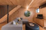
And with the interiors he also went for a minimalist look to make the spaces feel bigger – skirtings, architraves and door reveals were detailed so as not to be cumbersome or intrusive.
The CLT floors and ceilings and ply wall linings offer the warmth and quality feel of solid construction, as well as being durable and easy to patch repair. The CLT also allows for flush fitted LED strip lighting. The lighting was designed with carefully selected wattages and locations to offer statement lighting without additional fittings needing to be added, maintaining a minimalistic look.
Compact laminate has been used for the custom-designed kitchen island and vanities. This material offers a durable finish and is impregnated with silver to maintain a hygienic surface. The solid block of colour offers a counterpoint to the heavy use of timber. The black exposed edges to the laminate mimic the black negative details to the wall linings.
Resene ‘Unwind’ was selected to match the colour of the compact laminate and has been painted on the bedroom wardrobe sliders so all rooms have a splash of colour to contrast against the natural tones of the timber. Blue tiles were selected to bring the ‘New Denim Blue’ from the exterior COLORSTEEL® to the interior, while offering a subtle contrast to the black fittings in the shower. The application of the tiles to all surfaces in the shower including the ceiling, combined with the timber slats to the floor, help to give a feeling of a luxury spa.
The architectural stair built from the same materials as the rest of the building ties it in with the home, as opposed to feeling like an addition, while the open tread stairs and open balustrade ensure the surrounding space still feels airy.
Outside, Mitchell has cleverly integrated large garden sheds with hidden doors so they look like they are part of the fences and don’t intrude on the outdoor areas or detract from the clean lines of the main building. Access to the back unit is down an alleyway on the south side. The alleyway is private with the two units opposing each other with no south-facing windows to ensure they don’t overlook each other. The street art on the existing boundary wall helps to give the impression that the back unit is accessed off their own street. Careful detailing and high quality materials to the inter-tenancy wall mean there is no airborne or impact sound transferred between the units.
Special attention was given to all the detailing of the interior and exterior to give the overall feel of a refined singular ‘product’, as opposed to a building that has been pieced together from various parts.
Mitchell says this method of building gives you “a lot of bang for your buck. It’s by no means cheap but you get really good quality for the cost,” he says.” I would like to do more of them and work on the combination of design elements and materials to make them as cost-effective as possible.”


