Beautifully blended with its landscape

The owners sought a place that reminded them of their former hilly and windy site, overlooking the sea in Wellington while connecting to their new home in Christchurch. The north facing site on the last recorded lava flow on Banks Peninsula gave them everything.
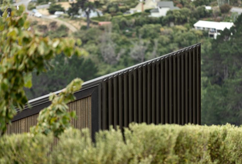
The design echoes a strong belief that shelter needs to be grounded in its setting to enable people to connect at the most basic emotional levels. This house was designed on multiple levels with the whenua. The form sits softly on the landscape, not fighting but softly bending with the shape of the land. Its colours are selected from those naturally occurring in the landscape; the roof form matches the slope of the land and the detailing, using Canterbury prickles reflects the broken form of the Port Hills. Over time the house is designed to disappear into its landscape as the native trees grow back around it.
One room wide
The brief was for a house for two people with a love of cooking with space for an extensive craft art and Pasifika collection and a classic car; the response is a linear form arranged from public to private along a 40m plus gallery space.
From the entrance the house offers a deceptively small façade with a simple and strong form, nestled in amongst large boulders that have been dug up on site. The house is entered through a compressed, cave-like space, designed to hold some of the owners’ cast glass collection.
Service space and guest rooms are accessed via hidden doors off this one-room-wide gallery. At the end of the gallery, the cave opens to a lofty timber box, housing the kitchen, dining and living space in an open arrangement. The kitchen, with a 5.5m long prep bench, is designed to allow both owners to cook together. The emphasis of the living space is directed out to the 200-degree view of Whakaraupo, Lyttelton Harbour and this area holds the majority of the owners’ artwork.
Beyond the living space, the plan blends gently through a library space to the main bedroom at the end of the house. Internally the material choice reflects the natural aspects of the design: all walls and ceilings are lined with birch ply offset by darker oak highlights for trusses and ceiling battens. All joinery and doors use the same birch ply as the walls and the flooring is a combination of rubber and carpet tiles reflecting the timber and the rich greens outside.
Sustainability
From the outset, the design was conceived as a low energy build. The building envelope is designed at over twice code for insulation and thermal efficiency. The majority of the glazing is specifically designed to heat the floor slab between the equinoxes, lowering reliance on additional energy. The house is heated with an ULEB fire which is used as a cooktop (and phone charger). The internal forms are designed to allow good ventilation on hot, nor-wester days; spaces within the house can be sectioned off to allow smaller areas to be heated. There is no cooling.
Materials have been generally chosen for low embodied energy – except the concrete slab – with a strong use of sustainably sourced timber. The design module has enabled minimal waste of manufactured building materials and the house is designed to last and to be easily repairable.
The design of the building purposely has a ‘soft and hard’ nature with the street side using a metal cladding. Designer Dennis worked with the Metalcraft team to select a cladding that expressed the nature of the site and work well with the curved and straight walls. Together with the Metalcraft technical team, a ‘Canterbury prickle’ detail was developed to suit the site wind exposure. The resulting ridge detail is thus critical to the minimal design aesthetic.
A double winner at the 2020 Canterbury Architecture Awards (a Housing award and a Resene Colour Award), the Chippindale/Grinham house, designed by Dennis Chippindale, principal architect at Stephenson & Turner as his new home.
Simple design, perfectly executed
The long, slender residence with its 200-degree view of Whakaraupo/Lyttelton Harbour was designed to sit unobtrusively within the landscape rather than showing itself off.
“It isn’t overly complex”, says Dennis. “As time goes by I think I become more subtle. Every last panel joint in the house lines up, for instance, like a piece of joinery. That was definitely extra work for the builders but you see it when you look for it – that apparent simplicity actually takes a lot of thinking.”
A 40-metre-long corridor forms the spine of the house, showcasing the couple’s art and books. “The house is really only one room wide. We wanted a single-level house in the hills, looking at the water – that’s how we’ve lived most of our lives.”
Unusual use of materials links the house with the land; some of the finishes are slightly unexpected like the carpet tiles in the living area and the full plywood interior. Each has been carefully chosen to reflect the landscape. The Canterbury prickle detail on the cladding was singled out for special attention by the NZIA judges who also cited the cladding as “a wonderful use of colour”.
Dennis used some of the rocks unearthed on the site to match the house colours to the environment. The volcanic boulders finally made themselves useful after proving a bit of a challenge during the build.
The low-profile home is exactly what Dennis wanted: “It’s thoroughly modern and efficient while also being ruthlessly simple. It’s about home, comfort and simplicity – and an idea clearly expressed.”


