Sustainability and Colour
Has architecture become part of the Fashion Industry and been cursed by mock sustainability (green-wash) and the absence of colour?
A question perhaps we should all ask ourselves and to one very passionate architect, Daryl Cockburn, the answer is definitely yes!
Daryl writes:
Sadly architecture has become dominated by superficial fashion and thereby no longer a profession professing the wealth of successful precedence and international best practice for cost-effective, sustainable design and construction.
Often it would be more appropriate to give sustainability awards to the Mechanical Engineers who keep the buildings warm and cool in spite of the design. Many award-winning designs, including winners for sustainability, emphasise sustainability in terms of the visual environment which has become inappropriately dominant.
Vitruvius (1stC BC) got it right; “Nearly all good Architecture is commodious to fit its neighbours, not visually unusual or spectacular.”
Complicated, high-cost, unsustainable, structural engineering is required to support cantilevers, leans and slopes in many of the buildings we are designing. They are often clad with glass which is one of the most unsustainable cladding materials. Even triple-glazing loses four times the heat of 100mm batts, double glazing loses 700% more heat than 90mm batts and single glazing 1200%.
Structures should be simple in concept, having symmetrical plans, with short multi-spans, be as low-rise as possible and preferably using efficient sheet-bracing.
If District Plan height controls were measured to roof eaves, not roof ridges, it would encourage efficient roof trusses for simple pitched roofs, and cease the promotion of unsustainable heavy flat roofs, which are also more vulnerable to weather-tightness issues.
Controls should be defined in storeys to encourage tall stud heights, to permit tall windows, for the efficient gathering of daylight and sunlight. The old, beautiful districts of cities throughout the world are filled with tall windows, which is probably the easiest way of making cost-effective cubic buildings commodious, if not delightful.
The fashionable trend to colourless towns and cities, promoted by too many Architects, is a dull tragedy. Architecture is meant to be a profession whose members profess a body of learned skill gathered over centuries. It should comprise best practice based on precedence.
There is no city in the world which is black!
Aberdeen is probably the nearest with its indigenous dark grey granite, but it glistens in Aberdeen’s soft daylight and frequent drizzle. Until the BNZ building Wellington had no black buildings and it should have remained on its own, unique. Since then several black, macabre, monsters have arisen and many Art Deco and Neo-classic landmark buildings have had their beautiful modelling concealed by the removal of shadows and colour making them... black? Why? Is this an historical response to the horrors of war or the depression. Whatever the reason it is insensitive and ignorant of both history and heritage to paint them black. And what is the impact on the very young?
Traditionally black was only used on the trim of mock Tudor buildings and the like, or on shop-front glazing bars and doors, to allow the eye to easily pass to the products on display. We are one of the creatures evolution has blessed with coloured vision to enable us to select ripe fruit or nectar. We should celebrate the gift of colour whenever possible.
Worldwide the most attractive, commodious, cities are homogenous in materials and colours. The homogeneity often extends into the landscape and skyscape. In Spain and Broken Hill the terracotta ground colour is the most sympathetic natural colour for buildings. In Wellington various shades of cream show sympathy to our clay, and green is sympathetic to our bush. Off-white cloud colours are appropriate and Inter-war buildings probably used pastels such as sky-blue to great effect, as did Plischke in the design of Massey House
.
White roofs which reflect heat but don’t radiate heat, and are good for longevity, are by far the most sustainable for painted roofs but where they dominate views traditional Barn Red and Steelite Green have been an attractive part of our suburban scenery for perhaps a century.
And as for sustainability on roofs and buildings; Does black attract unwanted heat? Does it radiate wanted heat? Does it have a long sunlit life? These are questions we all need answers to before we simply “ follow fashion” as that would be completely irrational.
As a profession we, as architects and designers, have a real responsibility to guide our clients in the direction of good, logical and sustainable design. What we create now will have a lasting effect on future generations long after fashion trends have changed.
Following are example of colour used in sympathy to their location and design.
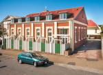
The Palazzo apartments are rarely on the market partly because they are very sustainable. Most windows were blocked-up to maximize the area of insulated building envelope and provide the minimum glass permitted by the code. The 3 storey roof-top houses have no structural steel and rely on sheet-bracing for wind and quakes.
The windows without balconies are painted fakes. Painted in clay cream which is sympathetic to Wellington’s natural environment combined with a white roof for sustainable, minimum radiation of wanted heat, and reflection of unwanted UV
St James
These 2 buildings in Newtown have metal roofs which can be seen and are therefore painted in a Wellington tradition; Barn Red or Red Oxide.
Council’s planning rules required demolition for car access. It took 3 planning applications to convince them to conserve the old brick Sunday School (beside the church). It contains probably one of the best rows of narrow houses in NZ,each only 2.7m wide but 100sqm in floor area. Each has 3 double bedrooms and 2 bathrooms.
The west wall of the new “barn”, which is above the car-parking, is close but gives the townhouses total privacy. The 2 barn houses face east
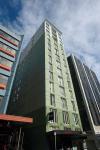
Astelia Hotel is architecturally (not mechanically) possibly one of the most sustainable high-rise buildings in NZ. Its floor plans are very efficient, and is structurally almost 100% symmetrical for perfect seismic response. Very sustainable with no excavations (except for piles), no car-parking & no cart-dock. It has the maximum area of insulated envelope permitted by the code and the minimum permitted glass. Painted sympathetic to Wellington bush green and white clouds.
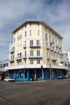
Peddle Thorpe Montgomery made good choices for Il Casino. Another Wellington green on Wellington cream clay, with white trim and very dark brown for the shop-front frames.


